Trustpilot Reviews

 Garry Edwards

Photographing bottles isn’t especially difficult, people just think it is.
It is though a big subject, because there are loads of different ways of doing it, and different approaches will produce different results and create different thoughts and emotions in the viewer’s mind. For example, we can produce a very straightforward, simple shot of just the bottle, which is what I’ve done here. Or we can produce a lifestyle shot, complete with its environment, some glasses, people – whatever. Or, for old, fine wines, or old whisky, we might want to take the shot in the winery or distillery, complete perhaps with old casks, cobwebs, and all the things that make it look authentic.
As with most subjects, there are no rules as such, but there are always things to think about. For example, if you’re going to include glasses, the number of glasses (and the other props) will define the impression that the photo makes on the viewer. For example, a single glass can indicate an alcoholic, two glasses indicate romance, several glasses indicate a party.
But, however we go about it, the lighting on the bottle itself can only be done in a limited number of ways, and it’s the lighting that we’re talking about here.
First, a confession: I hardly ever drink, so I haven’t actually got any wine glasses. What I have got is this bottle of Port, which someone gave me a long time ago, and which I came across in a cupboard, covered in dust. I spent a long time cleaning it up, which is essential, but I couldn’t get rid of all the muck, some of which is still visible.
I have no idea whether it’s a good Port or not, but it’s a good subject because the bottle itself is clear glass and has red contents, and a label with fancy bits in it. Labels are important, we’ll come back to that later. The other thing about this bottle is its shape. Bottles come in all sorts of shapes, square, flat ones are a piece of cake to light, this shape is less easy and, just to make it a bit more difficult, even the sides aren’t straight, it barrels inwards towards the bottom.
The pic on the right shows what it looks like, photographed straight on with an on camera flash. This is just for reference. Obviously, there is a horrible reflection where some of the light is bouncing straight back at the camera. The primary job, when we photograph something like this, is to control the reflections so that we use them to our advantage. I suppose that it’s almost possible to get rid of reflections altogether, by photographing the bottle inside a light tent, but that isn’t what we want to do – what we want to do is to control the inevitable reflections so that they become part of the subject and don’t detract from it, and so that they define its shape. We do this by producing diffused specular reflections, which I’ve written about before. A specular reflection is the inevitable reflection of the light source, and a diffused specular reflection is one that has been made large and semi transparent, so instead of dazzling the viewers, they can see through it to the subject below. You can see these diffused specular reflections on both sides of the bottle, forget about the label for now.
You’ll see that they have been positioned so that they don’t quite light the edges of the bottle, that’s so that the bottle can be against a white background if required, we don’t want the edges lit, and disappearing into the white background – we’ll get to that later. It’s just a matter of positioning the light sources so that they are at the sides of the bottle, not behind it – easy.
Partly because of my involvement with Lencarta, and mainly because of the type of photography I do, I have a large studio crammed with all sorts of specialised lighting equipment, and normally I would use plenty of space and some quite rare tools for this, but because I want to make it easy for most people to do this, I’ve only used a small area of my studio, and have only used pretty basic gear. The background is just a white wall, it doesn’t look white at the moment because it hasn’t been lit yet, and the bottle is standing on a glass topped table, to create a semi reflection of the bottle. As an alternative, the reflection could have been created in software, but I like to do things in camera for tutorials.
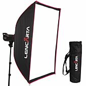
To create the diffused specular highlights, I used rectangular softboxes, which are ideal. A cheaper alternative would be a lighting silk, basically a piece of translucent white plastic held in a frame, with a flash shining through it, but it can be a bit fiddly getting the silk into exactly the right spot. On the right, I used a 140 x 30cm strip softbox, which is perfect for the job. Strip softboxes were actually designed specifically for lighting bottles. It was positioned so close to the right hand side of the bottle that it was literally only just out of shot, this is essential because of the convex shape of the bottle, which makes all specular reflections much smaller and brighter than you’d expect. What you can’t do is to use an umbrella, the light from an umbrella is too uncontrolled, and the lighting would also be uneven.
The softbox was positioned dead square to the bottle, to get an even reflection. You can see that a bit of light has passed through the bottle and is appearing along the left hand side, we don’t actually want that but it doesn’t show in the final shot. The lighting in the shot on the left looks very unbalanced, so how are we going to light the left side to balance it?
Well, in studio photography we often use reflectors for this, but as you can see from the shot on the right, a reflector hasn’t worked here. It couldn’t work, and the main reason for this is the inverse square law. The softbox on the right is very close, and the “spare” light that powers the reflector has to travel many times as far to reach the reflector and then bounce back again, as the light that travelled from the softbox to the right hand side of the bottle. I’ve measured it, the light from the bottle travelled 6″, the light from the reflector travelled a total of 48″, so the loss of light from the reflector lost at least 8 stops of light, which means that it did virtually nothing – so I used a second softbox on the left.
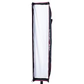
I didn’t use another strip softbox on the left, it wouldn’t have worked because it had to be too far away from the bottle, and would have only produced a very narrow reflection because of that. Instead, I used a 70x140cm softbox, which did the job. I then adjusted the relative power of the flashes so that each softbox had the same effect, in terms of the brightness of the reflection. Of course, the reason the light had to travel so far is that the bottle was sat on a table, I could have avoided the problem by sitting it on something much narrower, but I was trying to make this shot realistic for people who don’t have dozens of different bits and pieces lying around…
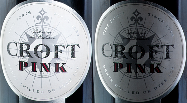
So, what we have now is the shot on the left. A little bit of the light is catching the label, but it isn’t right, we need to do more. As a commercial photographer, labels are the bane of my life! There is usually a second label on the back of the bottle, and if the contents are clear this needs to be removed, otherwise it will show in the shot, but because the contents of the bottle are coloured, that wasn’t a problem this time. Then there’s the position of the label. Clients often want the label dead central, and if that’s what they want then that’s what they get, but it can be a nightmare to get them perfect, so I often rotate the bottle enough off-centre so that the label picks up a bit of light from one of the softboxes, and looks deliberate – the worst thing in the world is to get it nearly central but not right.
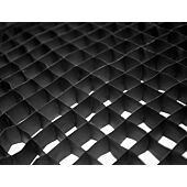
Normally, I would use a focusing spotlamp to light the label, it’s the perfect tool for the job – but, as most people haven’t got one, I used a tool which isn’t perfect but which works, and which is (or should be) found in most studios – a 10 degree honeycomb, fittted to a standard reflector. Honeycombs have two main uses, when used behind a subject and pointing more or less towards the lens, they reduce flare. But they also produce a much smaller circle of light than most other light shaping tools, and by getting it close enough, I was able to produce a circle of light of the right size.
But where should the light be positioned? Well, straight on can often work, but not in this case because the label is quite complicated and a straight-on light just produced unwanted reflections and didn’t show the label at its best. The shot below far left is with the light pretty much straight on to the label, and you can see for yourself that it doesn’t look as good as the shot next to it, where the light was off to the right and skimming across the label. The lighting in the shot on the right does the job, of course for a commercial shot I would have improved it further in Photoshop – or just used a focusing spotlight instead.
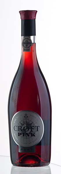
That’s about it, as far as the bottle is concerned. I could/should have lit the second label, on the neck of the bottle separately too, but this tutorial is really about the principles, rather than about a finished result, so I didn’t bother.
What I haven’t done yet though is to light the background, so the white wall, photographs as black because no light is pointing in its direction.
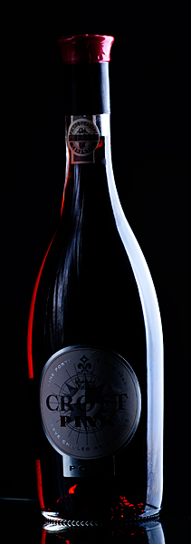
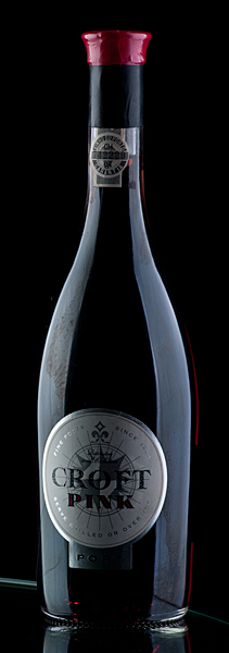
The choice of background, and its colour, is just personal taste, client requirement and suitability for purpose, and there are hundreds of different possibilities, I’ve just done a couple of choice here. Let’s start off with a simple white background, which is popular. The wall is now lit with a single light fitted with a small softbox (2 lights weren’t needed here because it’s a small subject) and as you can see, light is travelling through the bottle, showing the colour of its contents and creating a glow. Basically this shot is just an example of simple whitefield lighting, with the extra benefit of the added specular reflections and the light on the label.
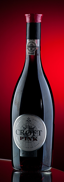
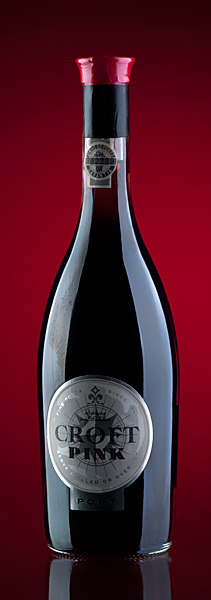
The other option I chose was to photograph it against a red background – after all, the drink itself is red. I didn’t want an evenly lit red background for this, partly because an evenly lit background of literally any colour makes the subject look flat and two-dimensional, so I went for a bright spot in the middle. I did this simply by removing the softbox from the background flash head, fitting a standard reflector with 10 degree honeycomb, fitting a red lighting gel over the front of it and pointing it where it gave the result I was looking for. My first effort was the shot above middle, this seemed to be to be a bit bright for my taste, so I turned down the power a bit, and ended up with the shot on its right. Adjusting the power affects the colour saturation and brightness of the result. You don’t need dozens of different lighting gels, basically you just need one each of the primary colours, if you want (for example a pastel pink, you just use more power. If you want it nearly black but with a hint of red, you set the power really low, and if you want something in the middle, you set the lighting power somewhere in the middle.
Not that it matters, but for this tutorial all shots except the final one are straight out of camera, apart from cropping and re-sizing. That’s what I always do on my lighting tutorials, so that you see the whole thing as shot, warts and all. On the final one, I did a bit of retouching too, basically getting rid of the edge of the glass table. None of the shots have been adjusted for colour, contrast, exposure or anything else. I used a Nikon D700 camera with a 80 – 200mm lens, set at 125mm. I like a bit of working space. And the flashes used here are the Lencarta SuperFast.
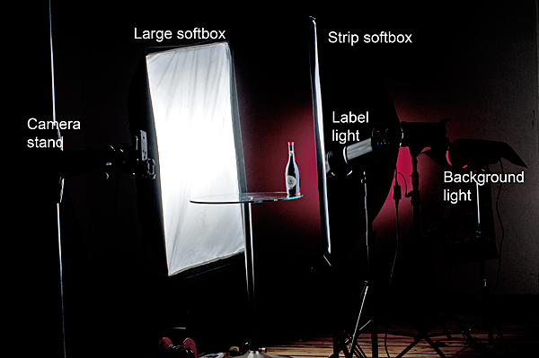
And finally, here’s a shot showing the positions of the various lights etc.
Guest Blogger, Author of 16 books on Photography